
Stats of the Union
100+
Downloads

Everyone
info


About this app
What’s the story of health in America?
Explore the nation's vital signs―from life expectancy to access to medical care―and make your own conclusions about America's health. See a stat you'd like to share? Save it as a snapshot.
Stats of the Union is powered by the Community Health Status Indicators (CHSI) report, which consists of data from federal agencies including the Census Bureau, Department of Health & Human Services, Department of Labor and the Environmental Protection Agency.
We've had a few inquiries, so here are a few details about how the application works:
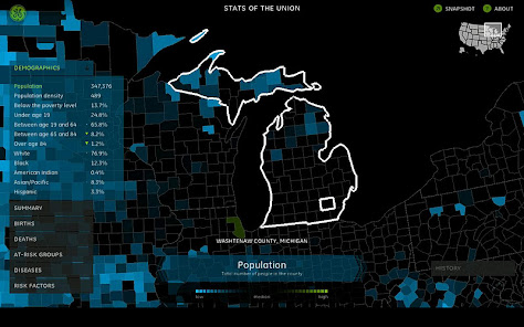
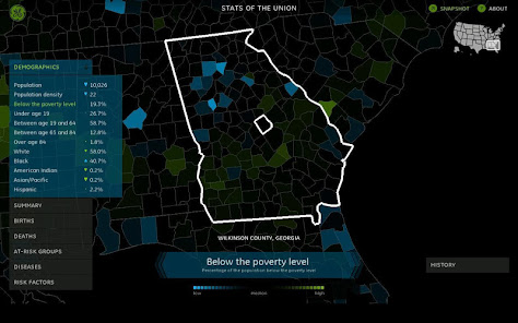
• Where applicable, the blue color is the “positive” side of the indicator, and the green is the “negative”. For this reason, the color scale will change between some factors. Otherwise you have a confusing situation where a large green area on one map is a problem area, where on another map, green would otherwise mean something more positive.
• The two color scale is used to provide greater contrast and make it easier to read: we want to be able to see how counties compare against one another, and also against the median. Because the numbers sometimes vary quite widely, we color the legend against the median value, instead of the mean (or average). Coloring above or below the median is in linear proportion away from median to the highest (or lowest) value.
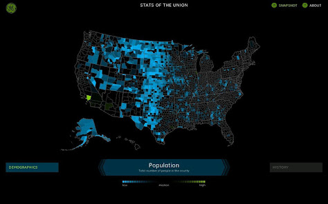
• However, using the median doesn't fix all of the enormous ranges in the distributions. In the case of the population map, for instance, the upper half of the counties have values quite close to the median value, so they're colored much closer to black. On the other side, there are many counties that have sizes much closer together, which causes there to be a large number of counties that are brightly colored blue.
• Similarly, the numbers are not shown on the legend because the coloring is in comparison to the median which makes a confusing situation where the numbers for the low, median and high are odd ranges (e.g. it might be 235, 1034, and 167000; or in the case of E. Coli cases, something on the lines of 0 (low), 1 (median), and 10 or so). More importantly, for values that are normalized by population, the absolute numbers high/low end of the color scale changes per county. So color is used to show differences, but with the left-hand menu open, you can see the details on any given value.
Explore the nation's vital signs―from life expectancy to access to medical care―and make your own conclusions about America's health. See a stat you'd like to share? Save it as a snapshot.
Stats of the Union is powered by the Community Health Status Indicators (CHSI) report, which consists of data from federal agencies including the Census Bureau, Department of Health & Human Services, Department of Labor and the Environmental Protection Agency.
We've had a few inquiries, so here are a few details about how the application works:
• Where applicable, the blue color is the “positive” side of the indicator, and the green is the “negative”. For this reason, the color scale will change between some factors. Otherwise you have a confusing situation where a large green area on one map is a problem area, where on another map, green would otherwise mean something more positive.
• The two color scale is used to provide greater contrast and make it easier to read: we want to be able to see how counties compare against one another, and also against the median. Because the numbers sometimes vary quite widely, we color the legend against the median value, instead of the mean (or average). Coloring above or below the median is in linear proportion away from median to the highest (or lowest) value.
• However, using the median doesn't fix all of the enormous ranges in the distributions. In the case of the population map, for instance, the upper half of the counties have values quite close to the median value, so they're colored much closer to black. On the other side, there are many counties that have sizes much closer together, which causes there to be a large number of counties that are brightly colored blue.
• Similarly, the numbers are not shown on the legend because the coloring is in comparison to the median which makes a confusing situation where the numbers for the low, median and high are odd ranges (e.g. it might be 235, 1034, and 167000; or in the case of E. Coli cases, something on the lines of 0 (low), 1 (median), and 10 or so). More importantly, for values that are normalized by population, the absolute numbers high/low end of the color scale changes per county. So color is used to show differences, but with the left-hand menu open, you can see the details on any given value.
Updated on
Data safety
Developers can show information here about how their app collects and uses your data. Learn more about data safety

No information available


